I recently took a graphic design course, as I felt that my art background was missing the digital component. Below are the projects I completed in Photoshop, Illustrator and InDesign with descriptions of what I learned.
Animation
Does the animation appear still? Refresh the page.
Project Description: Create an animated graphic (minimum of 10 seconds and 30 frames) using the frame-based timeline in Photoshop. It must include some form of animated typography, which must move or morph as part of the animation design.
Artist Statement
Project Description: Create an animated graphic (minimum of 10 seconds and 30 frames) using the frame-based timeline in Photoshop. It must include some form of animated typography, which must move or morph as part of the animation design.
Artist Statement

Illustrator
Project Description: The assignment was to design four compositions by choosing a noun, a verb, and adjective, and an onomatopoeia that were bound in some kind of theme, and design their descriptions. Some limitations include that they had to relate to each other in some way, the subjects cannot possess the power to locomote on their own, and only one pictoral image is allowed, it may not be on the noun, and it must be made using Adobe Illustrator. Each design is expressed in only solid colors, no tones or gradients.
Artist Statement: My theme was letters that make up my name.
Artist Statement: My theme was letters that make up my name.

|

|
Photoshop
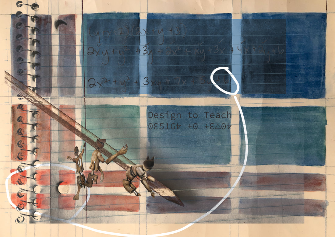
Project Description: The task is to create visual advocacy in response to the First Things First - A Manifesto, by Ken Garland. In particular, what "other things more worth using our skill, and experience on" Apply to graphic design or visual communication. Find at least four different images or objects that you shoot with a digital camera. The main task is to design a composition in Photoshop from your different images that are merged together seamlessly and aesthetically to communicate your response
Artist Statement: I was excited to reflect on the First Things First manifesto and think through how skills could better be used because I have recently moved into a line of work that I find empty in many ways. I miss doing meaningful work, and as I look around at my colleagues, I find brilliant people who are the experts in their field of microbiology, medical physics, computer science and education who have the experience and skill to do world-changing and meaningful work, instead in jobs at a financial software company making wealthy companies wealthier. When I think of the kind of work I find most meaningful, my thoughts often lead me back to the classroom. My previous career was teaching, and I found the experience of helping students on their path to something better to be exhausting yet rewarding. In particular, I am interested in teaching students the intersections between specifically math, and other subject matter. By integrating content, students have a deeper understanding of the intersection of the material. They are able to see the world through what they are interested in, and learn in multiple ways.
The four images I used were: a project from my graduate program in teaching polynomials through paint and area models, the traditional math that goes along with that area model representation, a piece of my undergraduate research project on unimodal frieze patterns, which studied one dimensional patterns and how they can be found in number patterns, and graffiti of playful surrealistic figures I found on the side of a building. I chose these to illustrate how the study of math can often complement the study of art. I included the figures to create interactions among the compositional components. Learning needs to be playful and interactive for students to internalize material. I chose to create the text of 'Design to Teach' with numerical characters to further illustrate this point. While I focused on a few principles of design, symmetry was most interesting, as we often think of symmetry simply, but the project I worked on shows that there are seven different kinds of one dimensional symmetry, and even more forms of two-dimensional symmetry, so even the intersections of those principles further shows the overlap in content.
Not having much experience with Photoshop, I learned in this project the complexities in editing photos and how to move beyond some of the basic frustrations. I also understand the concept of resolution and sizing much more thoroughly. I used channels to store a selection, and to store the color information. I had a few situations where I was trying to copy layers from one place to another, but even when I isolated the layer, the color information was altered, so I now understand how channels fix that. I learned how clipping paths use the pen tool to remove the background. I isolated a few images with this, but often found the stark, sharp lines to look unnatural. I learned how there are many ways to do the same thing. In the end, I removed the background wall from the surrealistic figures by using a layer mask. You can paint with black to hide or white to show what is visible, and modify the transparency and opacity to cater to the image. This all happens within the same layer. I also was able to isolate those figures by using the select color range feature. I also used that to copy over the notebook writing and overlap. I sandwiched the colored area models between two layers of that isolated notebook image so that it was less transparent where it does not overlap.
InDesign
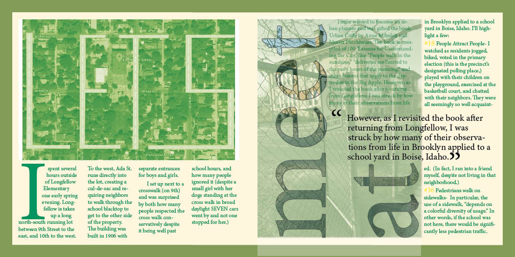
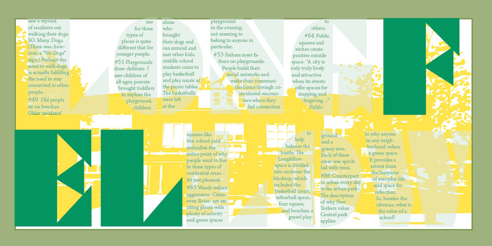
Project Description: Create a visual essay using communication clues you find in an urban environment. Clues include text of all kinds, images that direct, images that lend an identity to a particular area like; how does a park let you know it is a park? Document an experience you create with both image and original notes that will eventually become the text for this experience. One page must have image cover at least 50% of one spread.
Artist Statement:The theme of this piece is the importance of community spaces. By better understanding how community members use these spaces, we can better use them to make communities stronger. In my design, I thought about how to illustrate the interconnectedness of spaces visually. Maps of our physical spaces helps us better understand how we use that space, so in my design, there is overlapping of the green natural space with the orderly man-made ways of organizing the space. And furthermore, that these values aren’t unique to this particular school or community, but can be applied to rules of how people interact and live in their space.
Artist Statement:The theme of this piece is the importance of community spaces. By better understanding how community members use these spaces, we can better use them to make communities stronger. In my design, I thought about how to illustrate the interconnectedness of spaces visually. Maps of our physical spaces helps us better understand how we use that space, so in my design, there is overlapping of the green natural space with the orderly man-made ways of organizing the space. And furthermore, that these values aren’t unique to this particular school or community, but can be applied to rules of how people interact and live in their space.